Contents
Designing a Mental Health App For SCI Partners
Fostering connection, knowledge and emotional support for caregiving partners
Overview
Partners of people with a spinal cord injury carry the caregiving load with no dedicated space of their own. Feelinks gives them two things they said they were missing: others who understand, and knowledge they can trust. I ran the research, defined the product and designed it end to end.
Accomplishments
Interviewed partners across two countries and an age range of 33 to 73
Turned their accounts into two Jobs To Be Done that every feature had to serve
Separated connection and knowledge into two timelines so neither drowns the other
Designed for disclosure at the user’s pace rather than a public profile by default
Results
Testers completed both core flows without guidance, and the concept was recognised as theirs, not a generic wellbeing app
Participants recruited through patient associations in two countries; several asked to stay involved beyond the study
Set the scope, ran the study and designed the product myself, carrying it from a personal observation to a tested prototype
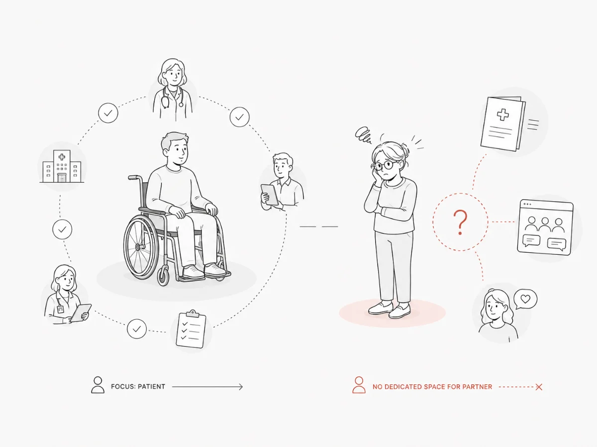
Partners of SCI patients lack a dedicated space for emotional support, shared experience and accessible knowledge.
Care pathways are built around the patient. The partner absorbs the practical load and the emotional one, and is offered nothing of their own. What they do have is improvised: a private Facebook group, a hospital pamphlet, one friend who happens to understand.
11 partners, two countries, one recurring sentence: nobody asks how I am.
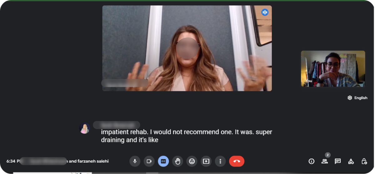
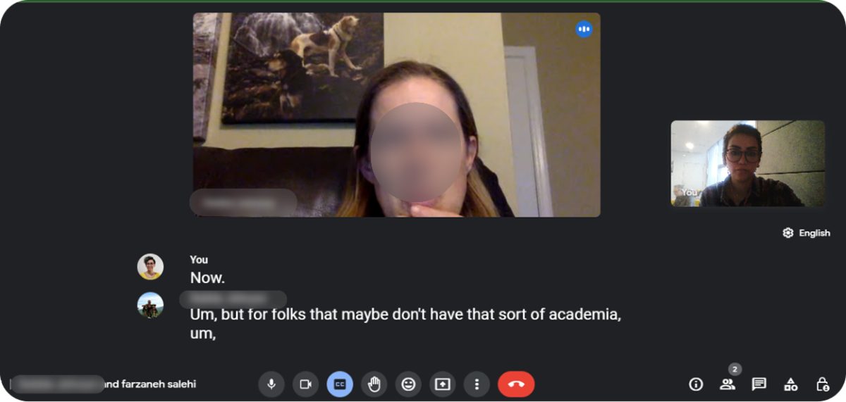 Sessions ran remotely and were transcribed; faces and names are obscured.
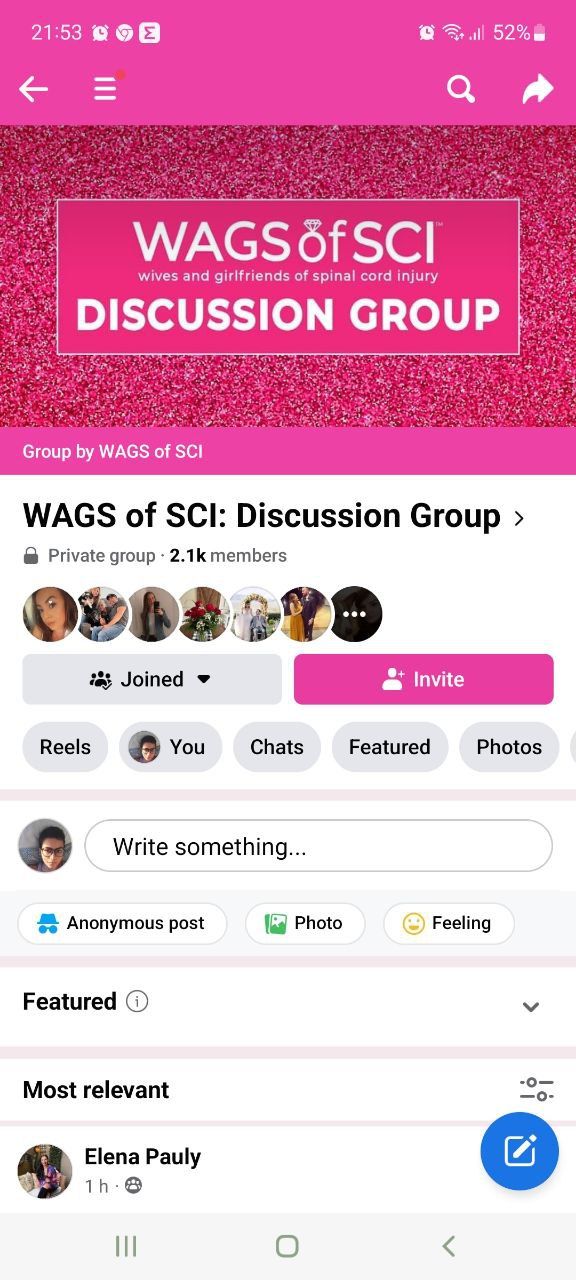 Today the community lives in a private Facebook group of 2.1k members.
42% of SCI partners report feelings of isolation and anxiety with nowhere to turn.
The coping strategies partners already use are improvised and private: a forum thread read at 2am, a pamphlet from the rehab clinic, one friend who happens to understand.
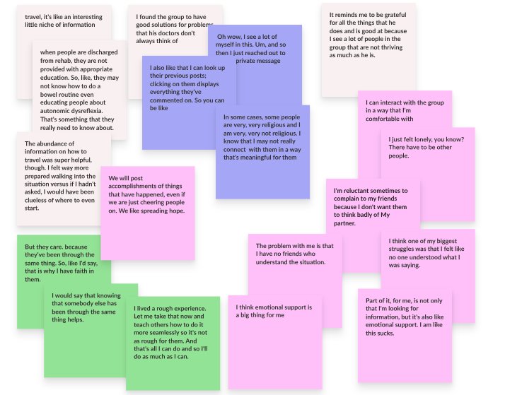 Clustering the quotes separated practical information from the need to be understood.
Two Jobs To Be Done emerged: establishing connection and gaining knowledge.
The two jobs run on different clocks. Connection is emotional and unscheduled; knowledge is urgent and specific. Framing them separately kept me from building one undifferentiated feed, and gave me two questions to design against.
HMW #1
How might we help SCI partners feel less isolated by creating a space to connect with others in similar situations?
HMW #2
How might we give SCI partners easy access to reliable knowledge about caregiving and emotional wellbeing?
Brainstorming against two HMW questions uncovered the features worth building.
Each idea had to answer one of the two questions or it was cut. What survived clustered into inform, connect and introduce. Anything that only served engagement, streaks, badges, public follower counts, was rejected: this audience is not short of pressure.
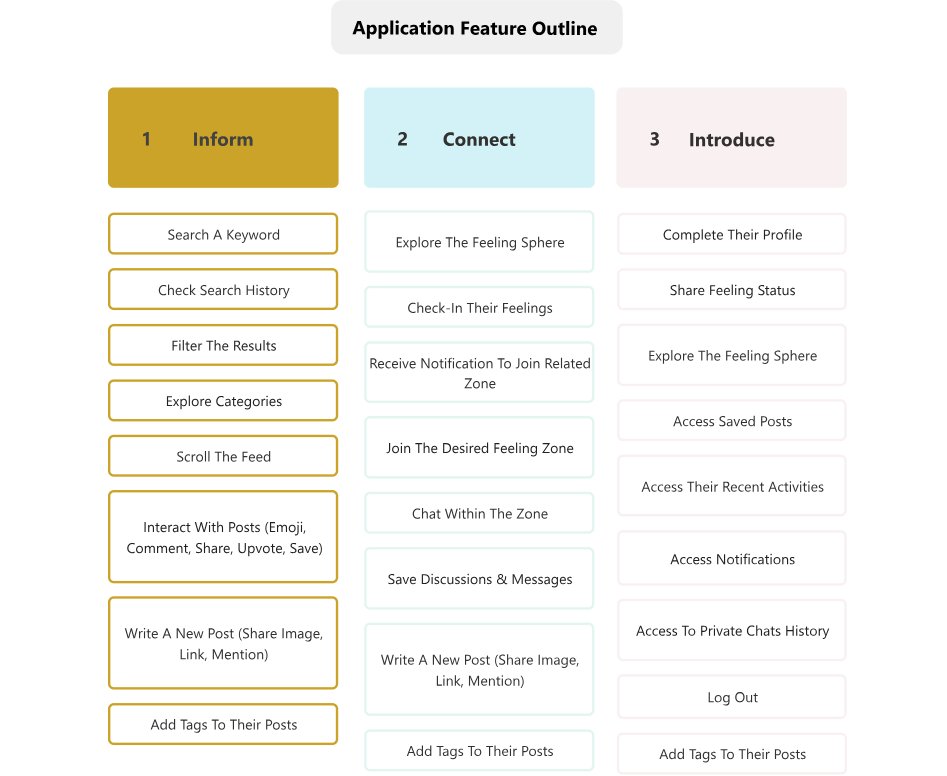 Every feature was filed under one of three jobs before anything was drawn.
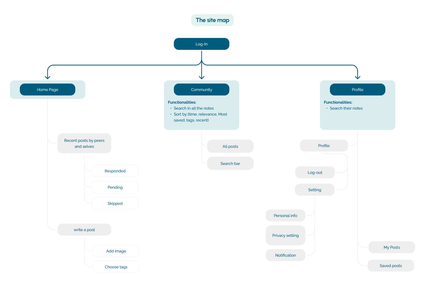 The site map kept knowledge and community as separate destinations.
Separated timelines for connection and knowledge discovery.
Two destinations, not one feed. The connection timeline carries feelings and replies from people in the same position; the knowledge timeline carries material you can search when something goes wrong at 3am. Structure and hierarchy were settled in greyscale before any colour arrived.
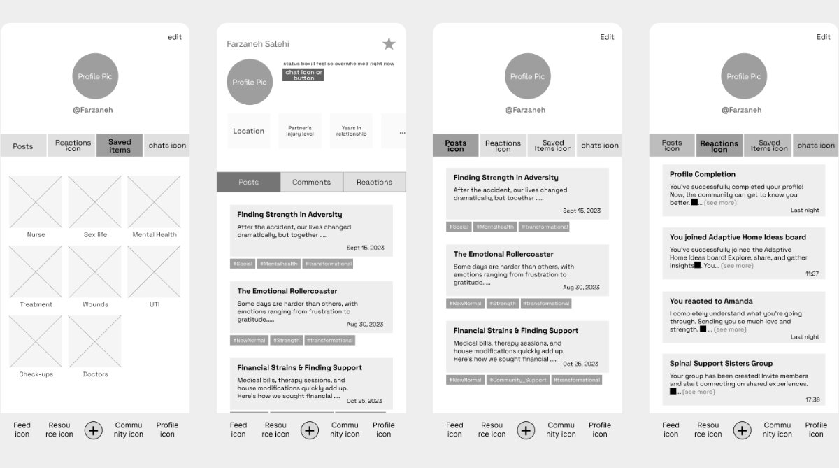 Greyscale wireframes: profile, posts, reactions and saved items.
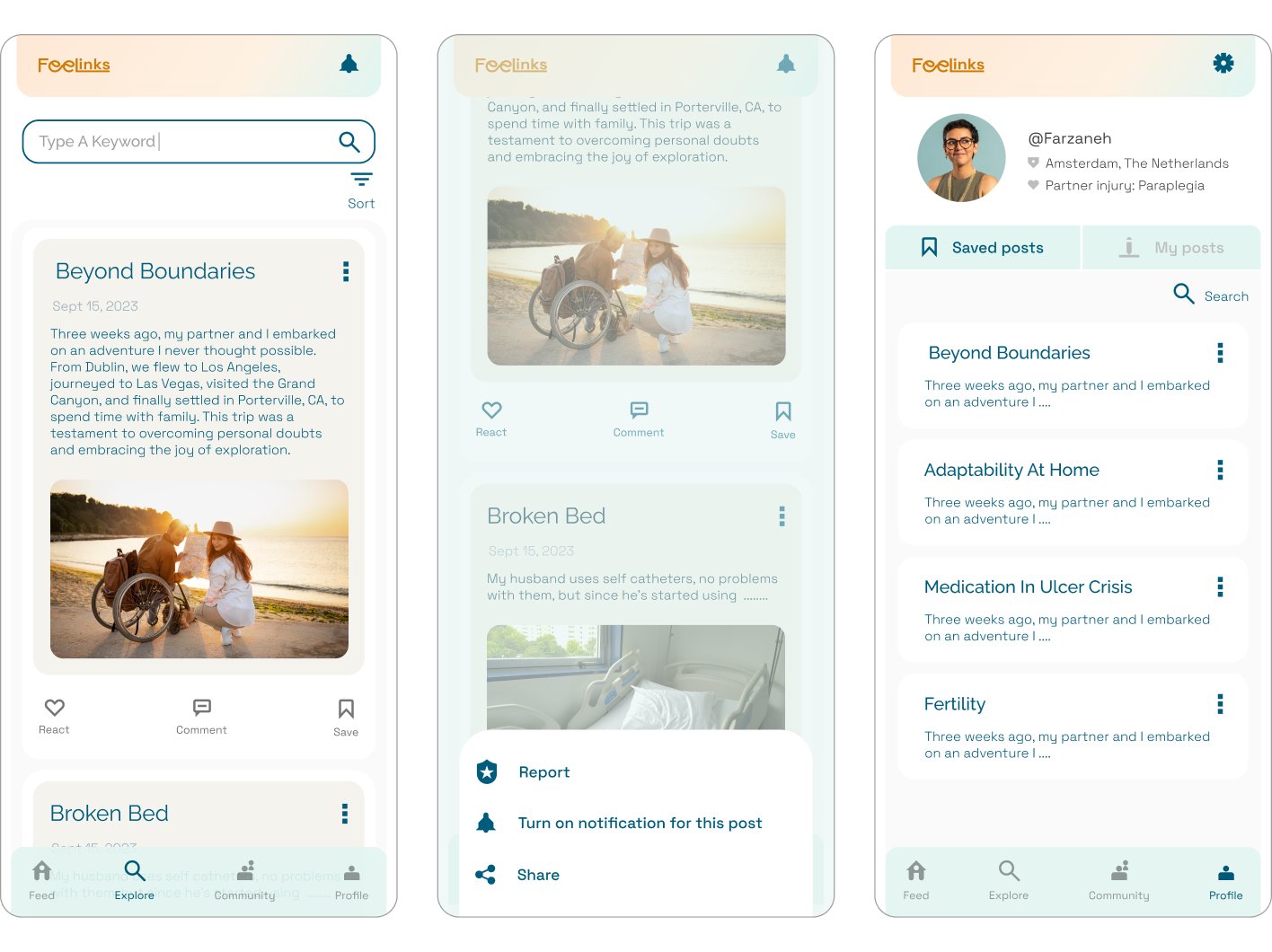 Screens in high fidelity, once the structure held.
The app gave partners the attention and the feeling of acknowledgment.
Testers completed both flows unaided, but the more useful finding was tonal: they described the app as something for them rather than about the patient. The fixes that came out of testing were about wording and disclosure, not navigation.
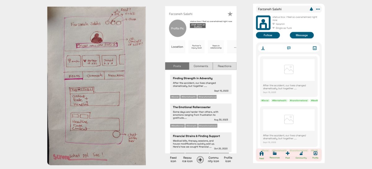 One screen across three rounds: sketch, wireframe, tested design.
A prototype that positioned Feelinks for real connection among its users.
Four choices that shaped the product, and what each one cost.
Two timelines instead of one feed.
Emotional posts and clinical information reward different reading. Merging them would have buried the urgent question under someone else’s hard day.
Disclosure at the user’s pace.
Partners are talking about someone else’s body as well as their own life, so the default is minimal identity, with more shared only when they choose to.
Curated knowledge, not crowdsourced.
An open forum was faster to build and worse to rely on. The library is vetted, which costs editorial effort and buys trust at 3am.
No streaks, badges or follower counts.
Engagement mechanics turn a support space into another obligation. Coming back after two weeks away should feel neutral, never penalised.
The prototype answered whether partners want this. What is still open is how it stays alive once real people are in it.
Seed the first conversations
An empty timeline fails a first-time user. The next round tests a small moderated cohort drawn from the partners already asking to stay involved.
Set the moderation model
Curated knowledge needs someone accountable for it. Partner associations are the likely route to clinical review without building an editorial team.
Test the quiet return
Usage will be irregular by design. The measure worth tracking is whether someone comes back after weeks away, not daily activity.